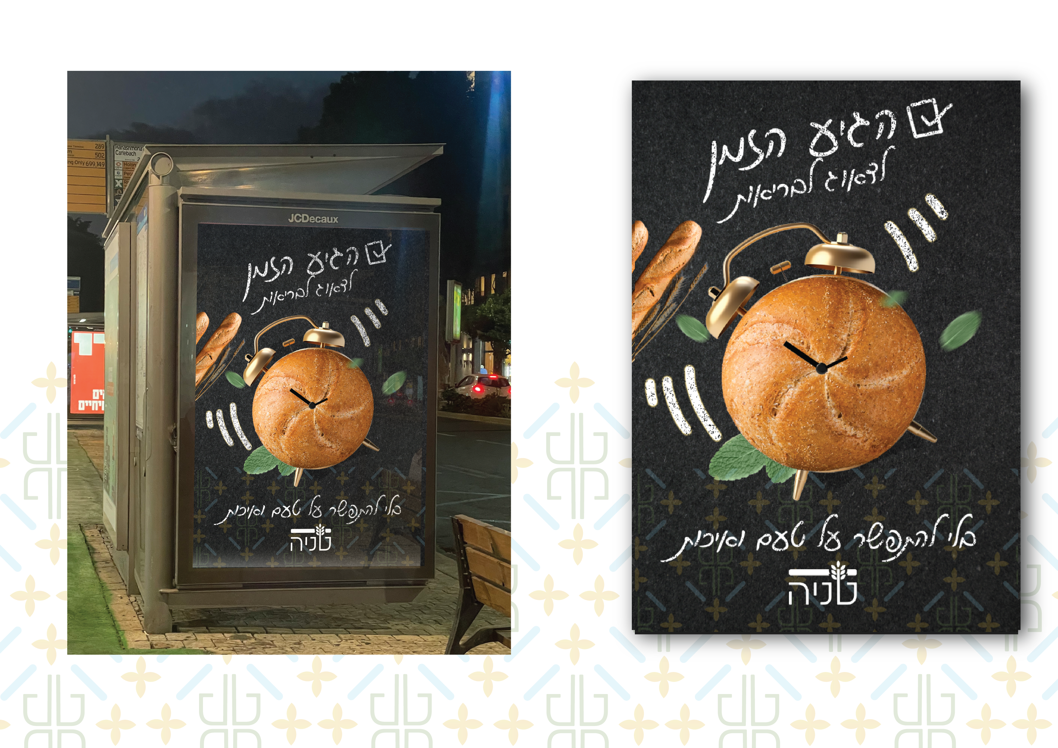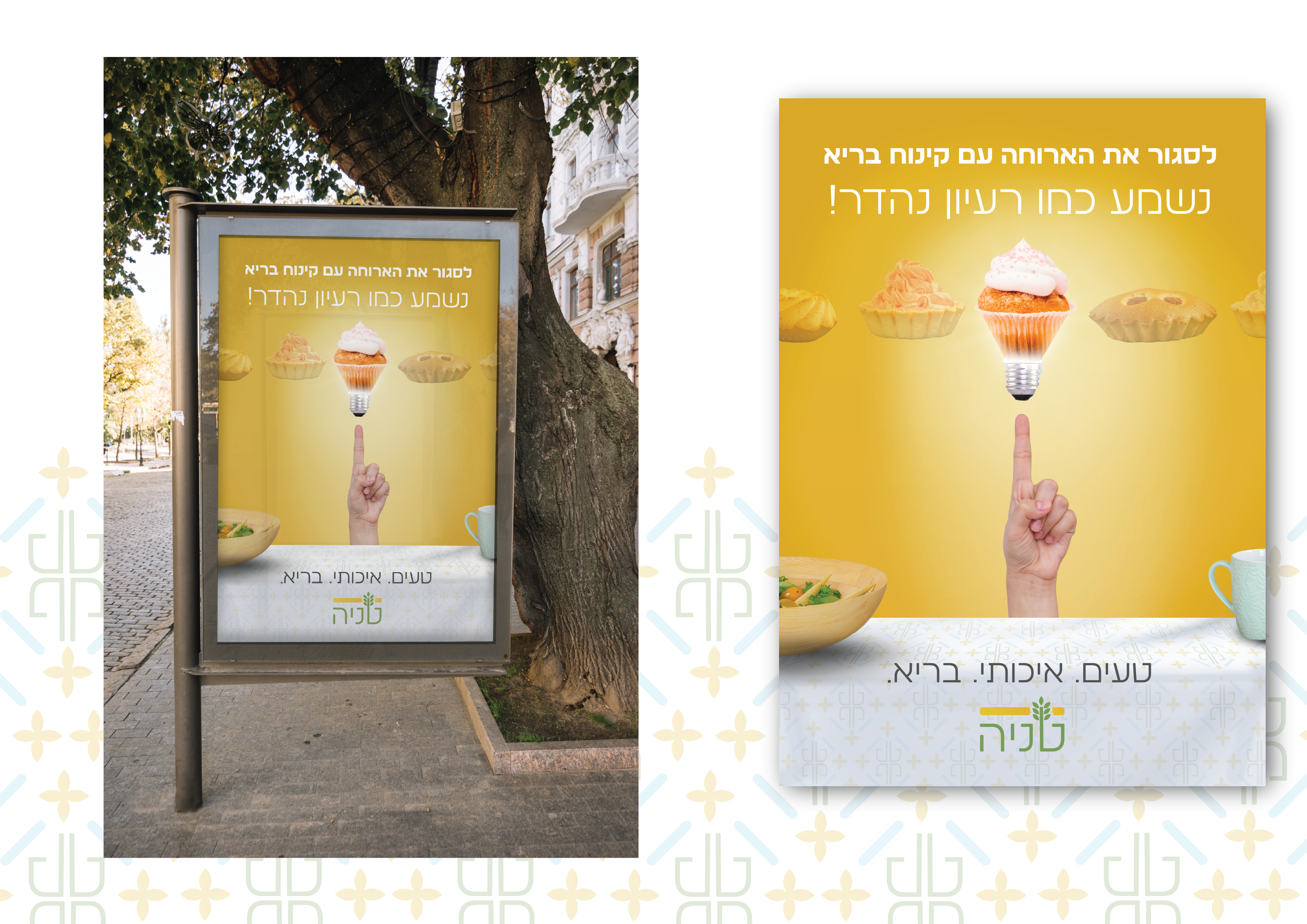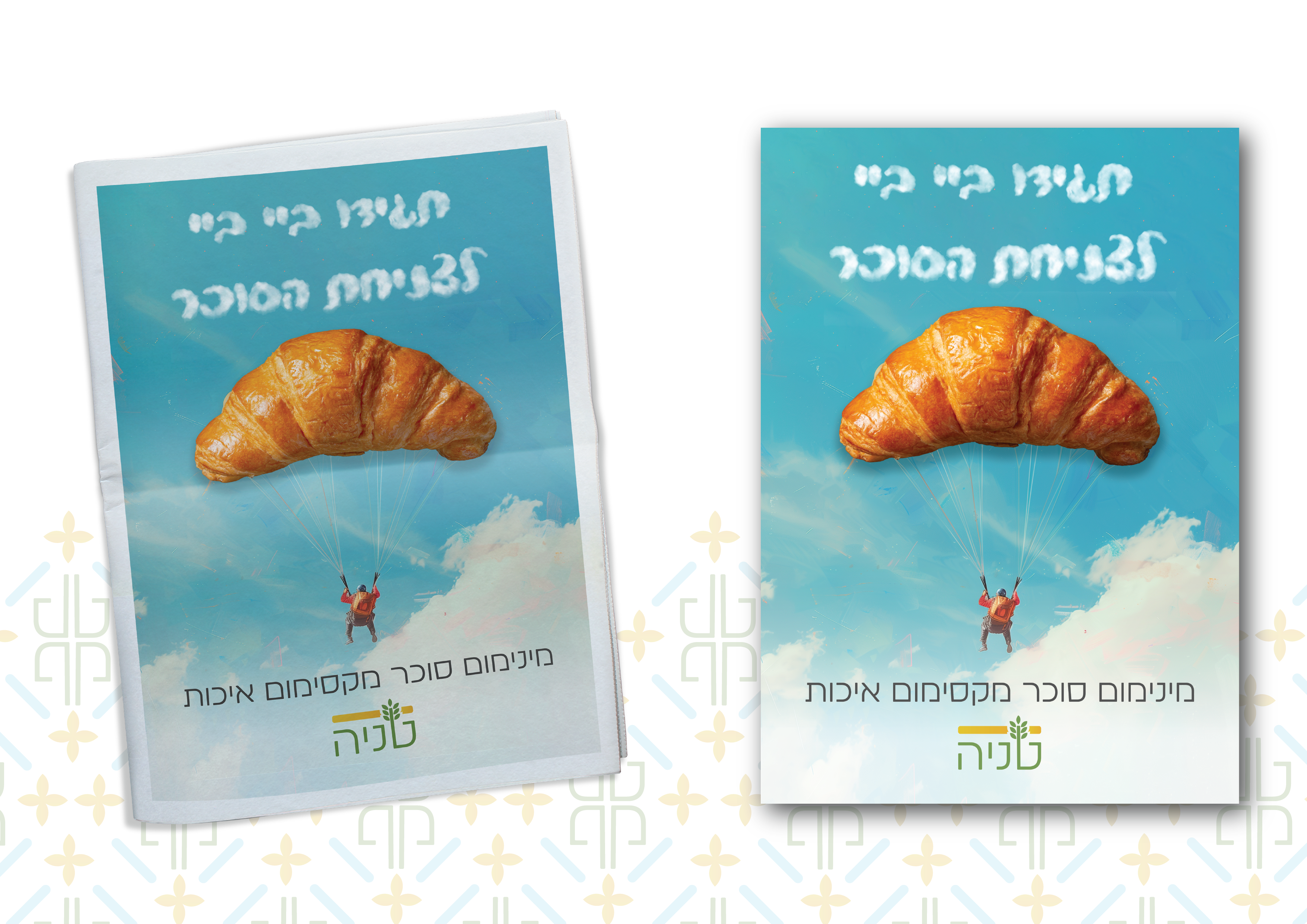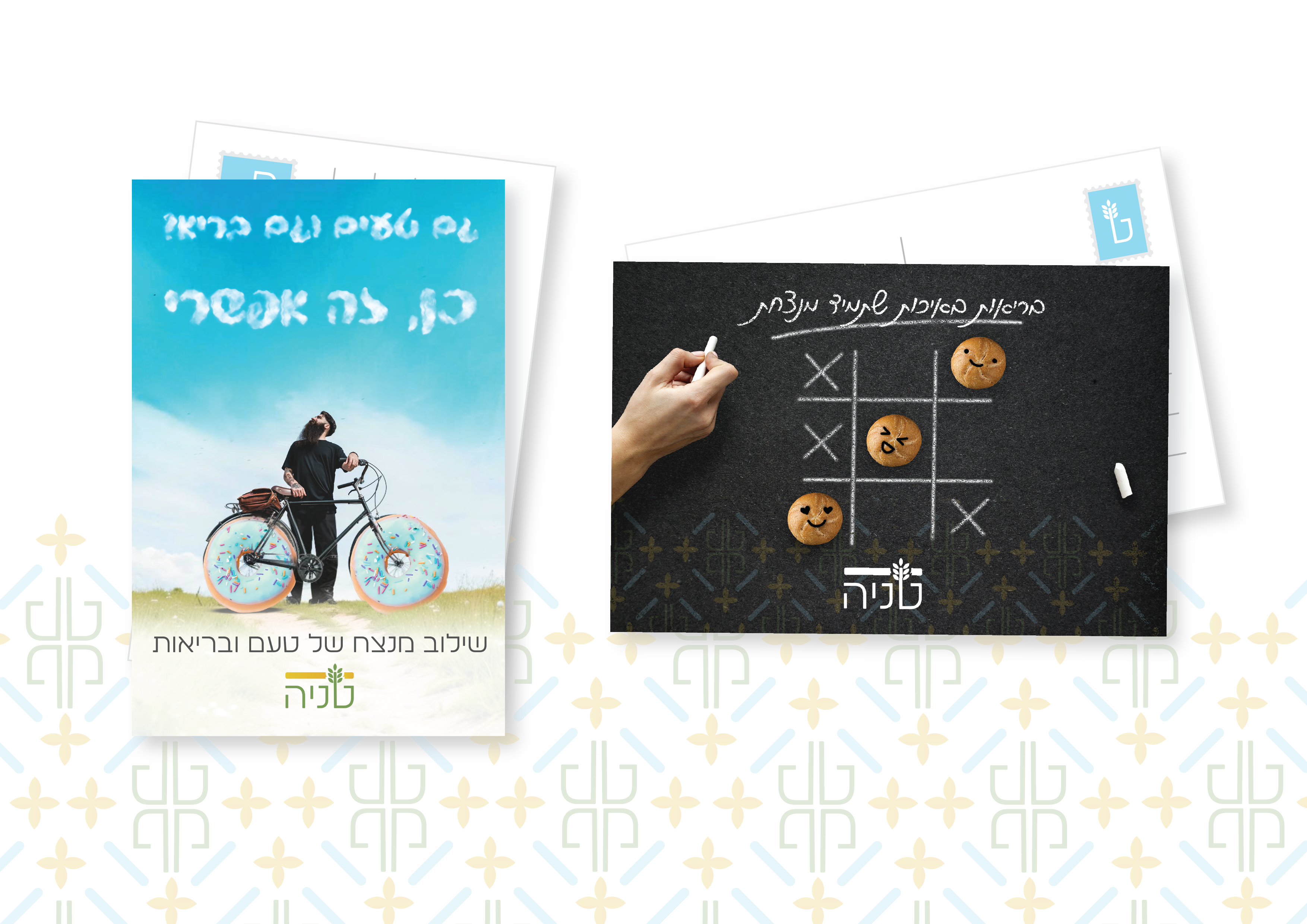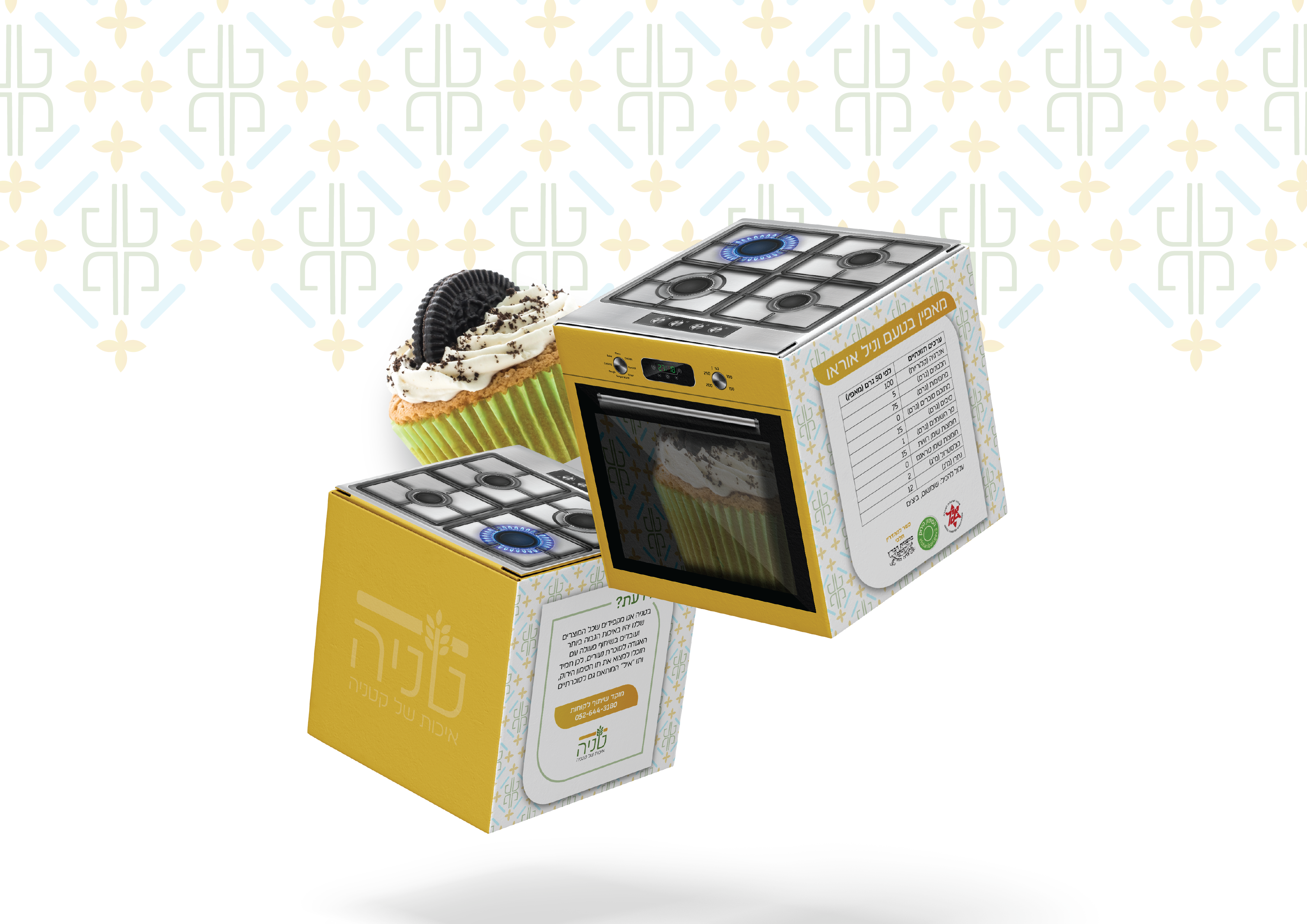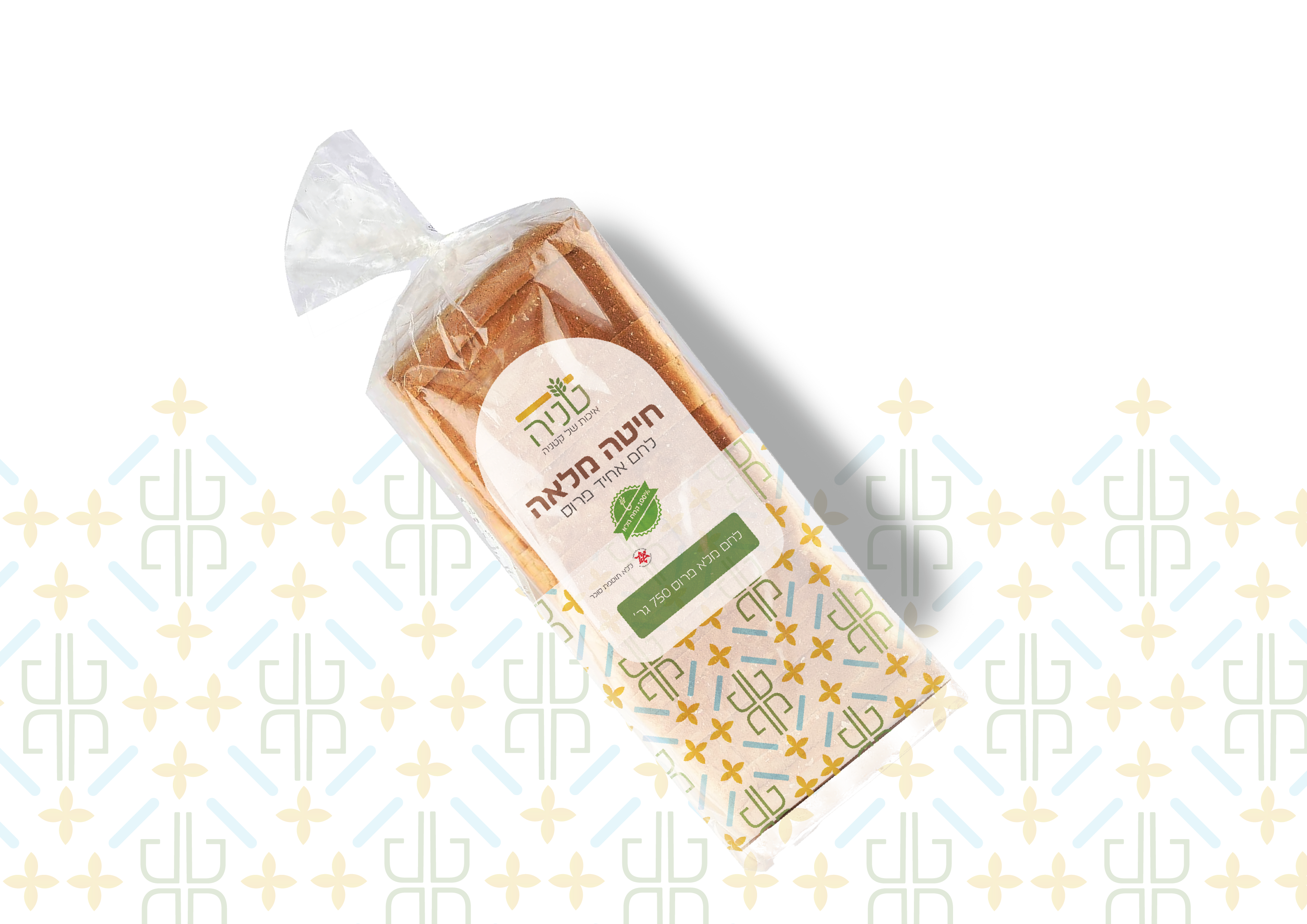
The brand "Tanya" focuses on creating a unique consumption experience that emphasizes both taste and health benefits. The branding process considered the business's aesthetics, reflecting modernity, quality, and health, and targeting two main audiences: health enthusiasts and those seeking high-quality alternatives to sugar-laden products.
• Exercise given by “john-bryce” institution
My tools
About
"Tanya" caters to a broad yet focused audience, with an emphasis on those 24+ years old who are aware of the importance of proper nutrition and its impact on their lifestyle. It appeals to people with an interest in natural, balanced diets. The brand is kosher for all cultural and religious groups. Prices are set to be affordable to the general public while maintaining the perception of high quality and health, giving the brand an accessible luxury feel
Style guide
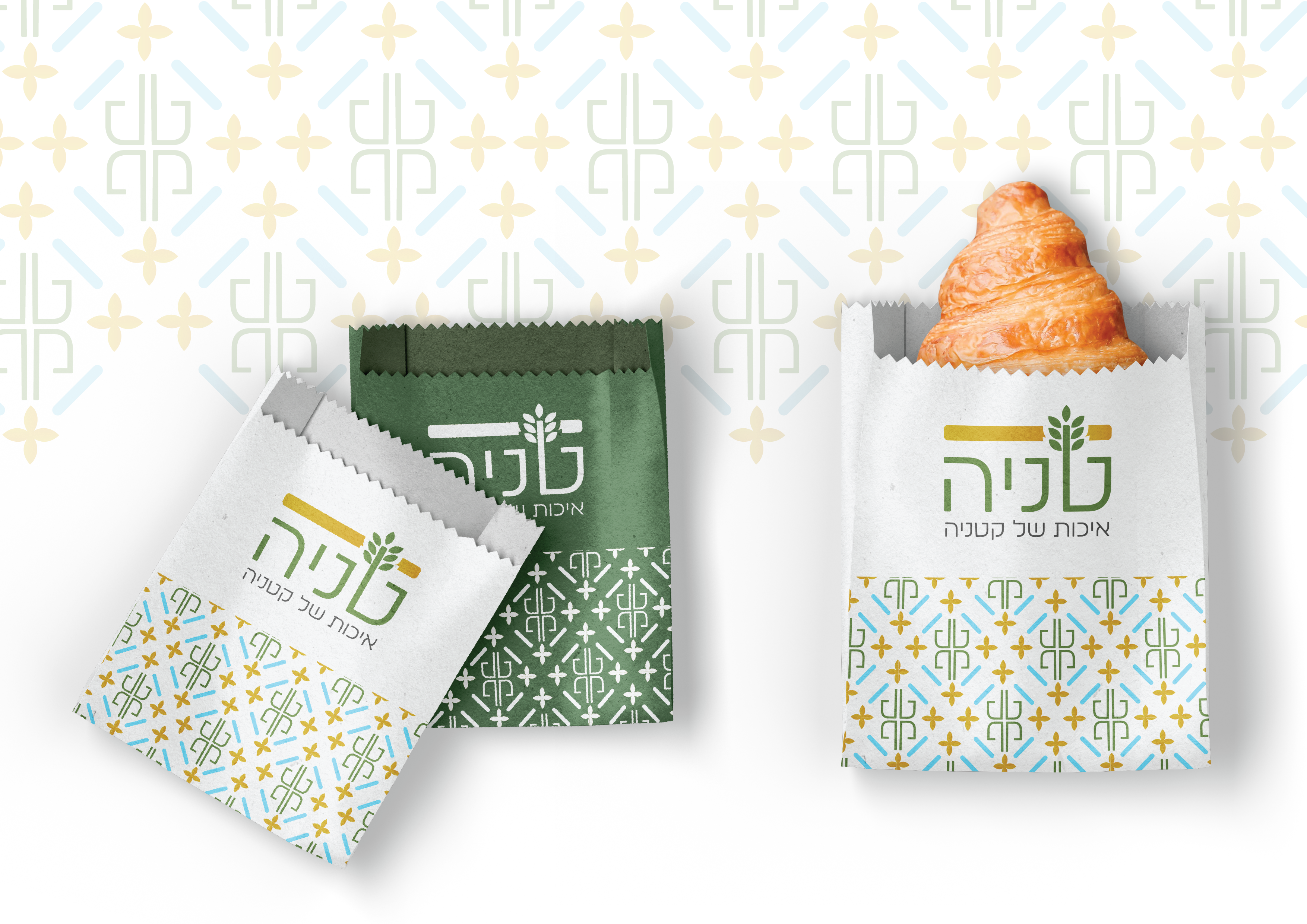
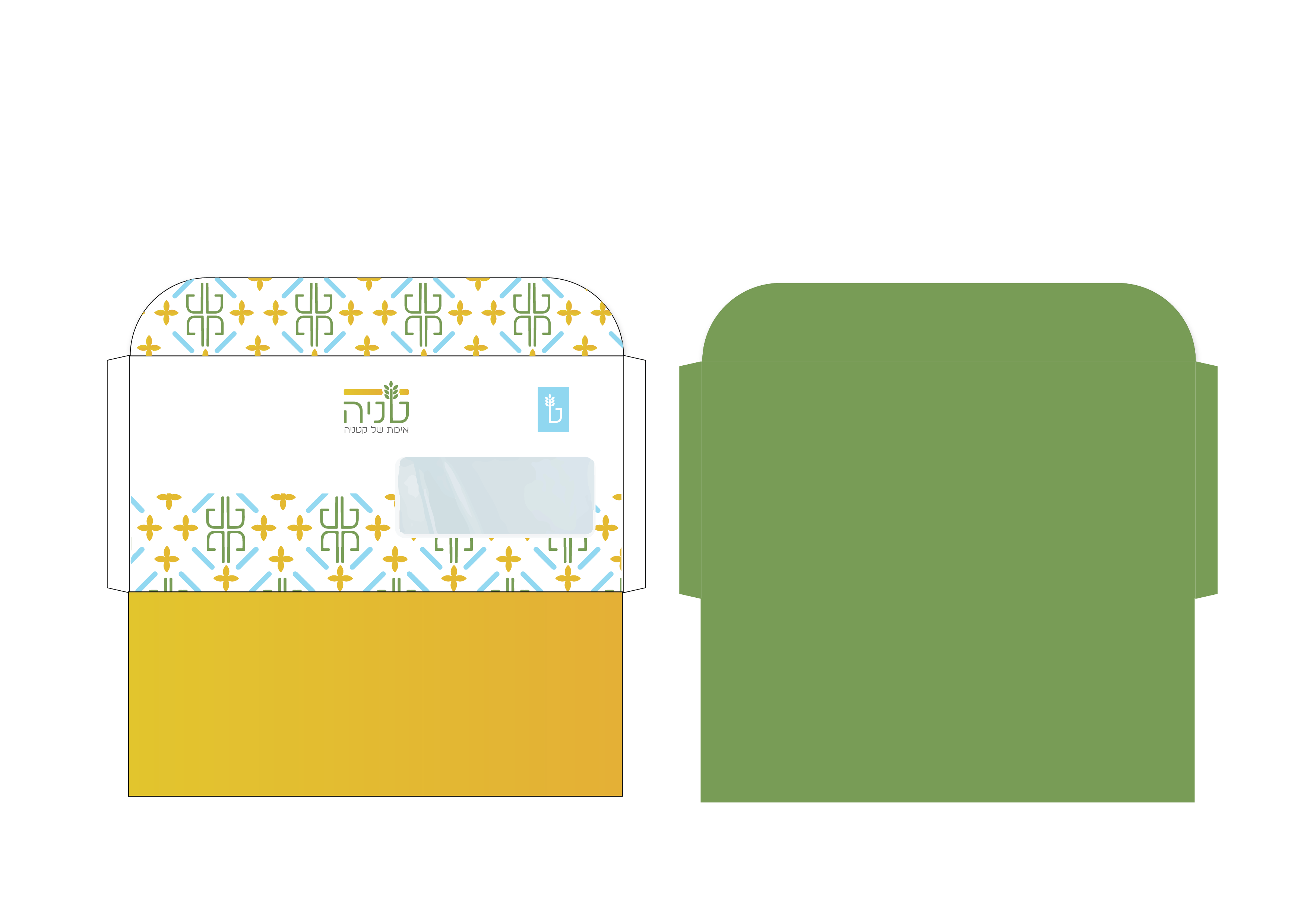
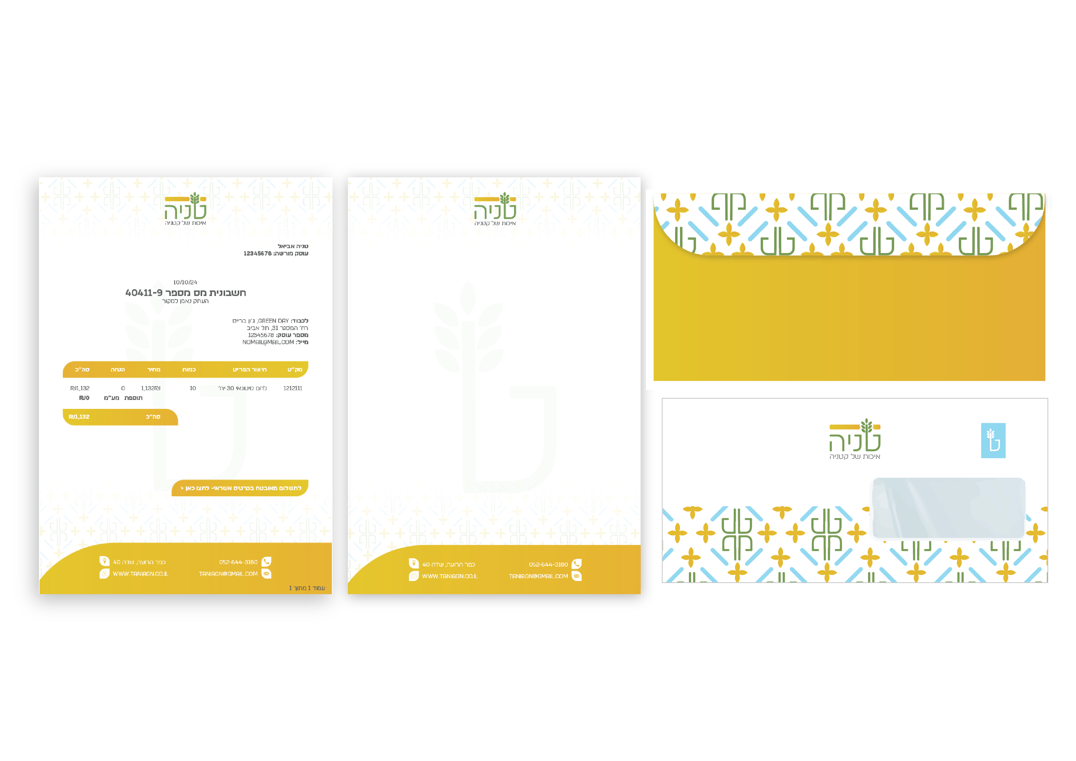
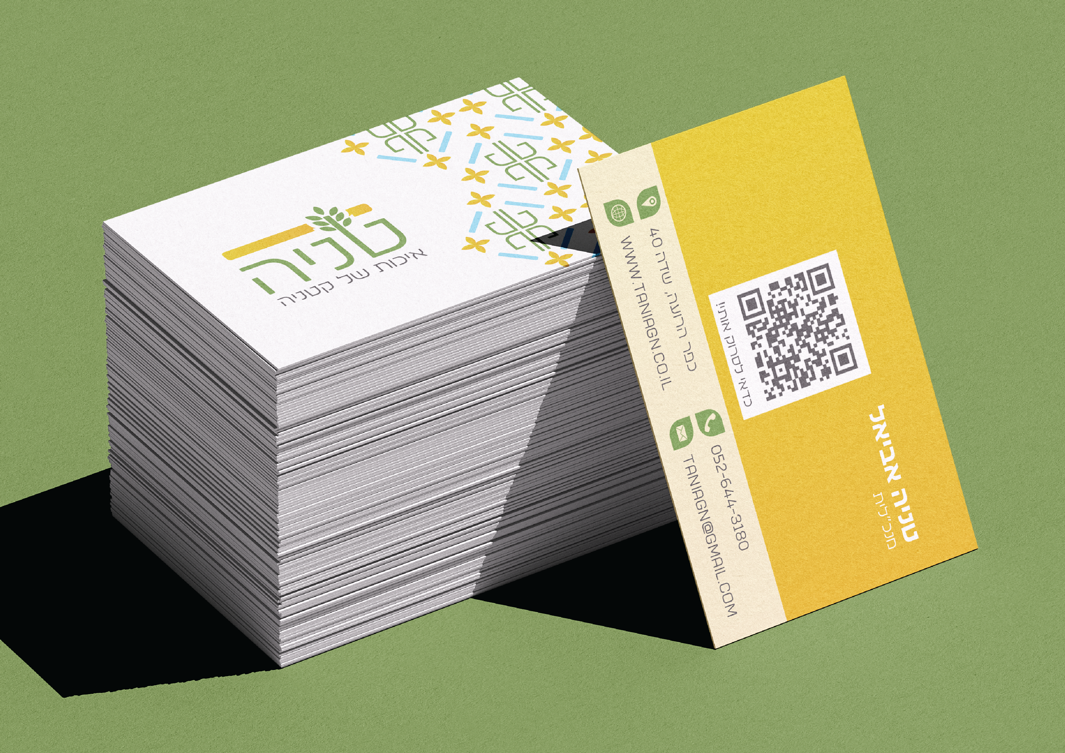
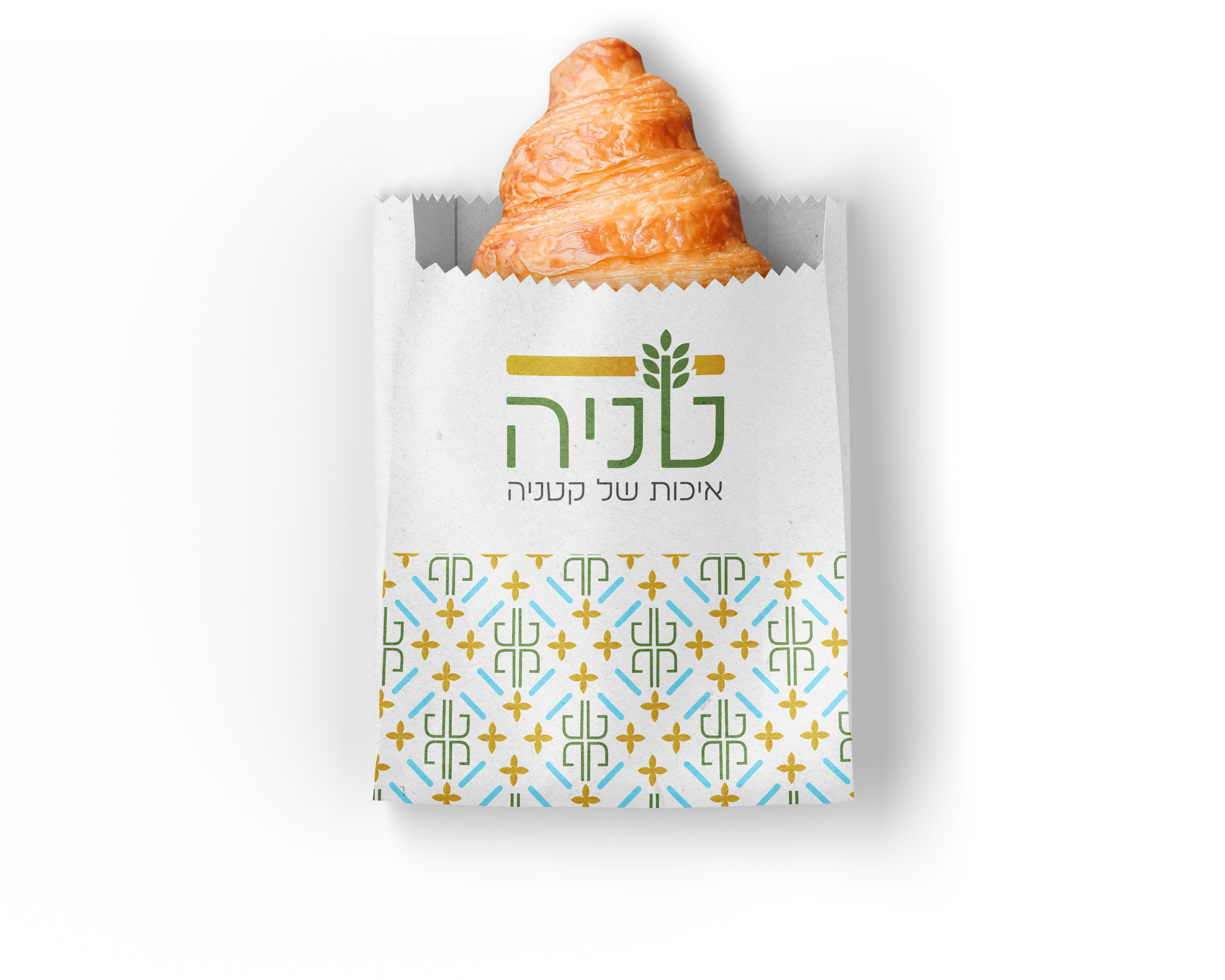
The logo features the brand name in green, combined with an orange cutting stripe at the top. For the first brand letter I created a wheat-like shape. The combination of all these elements creates a sprouting look, symbolizing the brand's focus on natural and healthy products.
Primary Logo

Secondary Logo

Logo Mark
![]()
Pattern and Assets
The pattern is designed to add interest to the overall visual appearance and create a strong brand identity that is easily memorable. It will be used as part of recurring motifs.
The pattern resembles vintage tiles style, while incorporating the modern colors of the brand.

Color Palette
Turquoise Cyan
Secondary Color
HEX: #83E8FF
The turquoise conveys freshness and modernity, adding a youthful and innovative touch to the brand.
Dark Gray
Secondary Color
HEX: #606060
The dark gray conveys stability and seriousness, offering a more refined alternative to black, and is primarily used for body text.
Orange Gradient
Primary Color
HEX: #E4C534
HEX: #E4B034
The orange adds vibrancy and positive energy, creating a sense of warmth.
Dark Green
Primary Color
HEX: #769B56
The green is associated with nature, growth, and health, making it a perfect fit for a brand focused on healthy legume products.
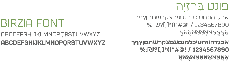
Typography
The Brezia font is a modern sans-serif typeface. Its style is neither too sharp nor too rounded, conveying seriousness, innovation, and quality, which align perfectly with the brand's message and image.
Illustrations